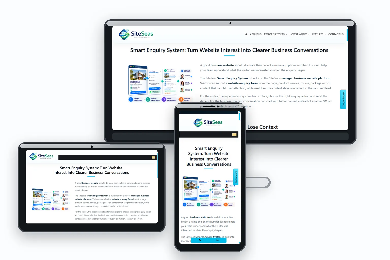
A business website is often checked before a call, after a referral, or while a prospect is comparing options. Before they study every detail, the design is already signalling whether the business feels established, current and easy to deal with. SiteSeas is a managed business website platform that uses ready professional themes, structured layouts and reusable components to give business content a clear, consistent visual system. The result is a professional website design that feels credible and organised rather than assembled section by section.
The same website adapts across desktop, tablet and mobile. Responsive website design keeps headings, text, images, navigation and enquiry actions usable as screen sizes change, so visitors do not have to pinch, hunt or struggle just to understand the business.
You do not need a large website just to look professional. A compact site can still feel complete when the pages you do publish are well structured, show the right proof and make the next action obvious. As the business grows, the same design system can support more services, products, photos, FAQs and content without turning the website into a patchwork.
Visitors should be able to tell what the business offers, what matters on the page and what to do next without decoding the layout. SiteSeas themes use defined heading, text and content patterns so the important message is easier to scan.
Premium does not mean crowded. Good spacing, controlled media, readable text and purposeful sections help a business website design feel considered and credible without relying on excessive animation or decoration.
When typography, spacing, media treatment and recurring components stay consistent from page to page, the website feels like one business property rather than a collection of unrelated pages.
Wider screens can use side-by-side content and larger media while keeping the main message and enquiry path easy to find. The layout should use available space without stretching text into hard-to-read lines or burying the next action.
As available width reduces, columns and media should reflow cleanly. SiteSeas responsive layouts adapt structured content so tiles, text and visual proof remain readable instead of being squeezed into desktop proportions.
On a phone, visitors need readable text, tappable controls, manageable media and a clear route to call, WhatsApp or enquiry actions. A mobile-responsive website should remain practical to browse, not merely fit inside the screen.
SiteSeas starts with a ready professional theme rather than treating every page as a blank canvas. Your approved business content, images and supported components are then arranged within that visual framework.
The theme provides the foundation; your actual business information, media and page structure determine what visitors see. The objective is a coherent website, not a decorative template showcase.
Products, services, photos, FAQs and proof often expand after launch. Defined page structures and reusable components help later additions follow the same design language instead of creating a patchwork of one-off layouts.
That lets the website grow while keeping the presentation familiar to visitors and practical for routine updates.
Different information needs different presentation. SiteSeas can use ready components such as tiles, carousels, tabs, accordions, image galleries and video sections so services, comparisons, FAQs, proof and visual content do not all become one long wall of text.
Because these formats belong to the same component system, a page can become richer without abandoning visual consistency. The dedicated Advanced Elements page explains the available component options in detail.
A prospect should not have to dig for the information that builds confidence. Services, credentials, examples, facilities, products or other relevant proof should be easy to notice and understand. Good design supports the message instead of competing with it.
Call, WhatsApp, contact and enquiry actions should feel like a natural next step, not an afterthought. SiteSeas keeps these actions within the same structured website experience so visitors can move from browsing to contact without a sudden change in layout or visual style.
Whether you need a compact starting website or a deeper product/service structure, the objective is the same: make the business look credible, keep the information easy to understand and keep the next action easy to find on every screen. Request a SiteSeas demo to see how your content could be organised within an available SiteSeas theme and component system.
Responsive website design means the page layout adapts as screen size changes so content remains readable and controls remain usable on desktop, tablet and mobile. SiteSeas uses responsive layouts as part of its managed website platform and checks real content, media, forms and enquiry actions during launch QA.
SiteSeas themes are designed to adapt across common screen sizes. Final mobile usability is checked with the actual page content, images, forms and enquiry actions because real content affects wrapping, spacing and how comfortably a visitor can use the page.
SiteSeas uses ready professional themes as the visual foundation. Your approved business content, media and supported components are then configured within that framework so the website stays visually consistent instead of starting every page from a blank canvas.
Clear hierarchy, consistent typography, balanced spacing, relevant media and obvious next steps all contribute. Premium website design is usually less about adding effects and more about making the business look credible, organised and easy to understand.
Permitted content can be updated through the SiteSeas administration system within defined page and component structures. This makes routine changes practical while helping new information continue to follow the same visual system.
No. A compact website can still feel complete when it clearly explains the business, shows the right proof and gives visitors an obvious contact or enquiry path. Additional pages should exist when they help visitors understand distinct services, products, locations or information - not simply to make the website look bigger.
SiteSeas is built around ready professional themes and a structured component system. Your business content is configured within that framework, while requirements that need work outside the supported design system can be assessed separately.